
How might we increase financial literacy and help people feel more confident about making the right money decisions?

While many interact with it daily, money can be a challenging topic for some people to discuss. Whether they are just starting their journey or are reaching the later stages of life, it seems there is always something more to learn. The Money In Excel team's goal is to meet people where they are, help them better understand how their finances work and cultivate good habits.
Financial literacy can serve as a tool to help people achieve financial success, which will ultimately also provide more security within their lives. Through MoneyMind, I wanted to explore solutions toward increasing educational opportunities while still giving people access to personal finance features.
I started out my research by looking at competitors and conducting user interviews.
Looking into the competitive landscape, I found that many other personal finance tools within the space included more flexible ways to view information, whether through desktop or mobile. Since Money In Excel lives within a spreadsheet, it felt unfair to compare it to these examples. This led me to consider conceptualizing an experience outside of the current product that could still include some key features and new priorities for learning.
As far as the educational aspects within these competitors, resources such as external blogs and helpful tooltips were available on some, but more could be done include engaging educational content within the first-run experience overall.

I spoke to 5 participants through Usertesting.com to discover the key moments in their journeys and how financial education fits into their life. After synthesizing my research, I formed an affinity map to find general themes from each participant.
Most participants saw financial literacy as a more learning-based activity, where they focused on building a fundamental understanding of their finances and, ultimately themselves. Another compelling insight was that 80% of participants began their financial journey after a significant life stage, most commonly after college. Other challenges they faced included experiencing trouble understanding financial jargon, which led many to turn to family and friends for advice.

Keeping my research insights in mind, I thought to narrow down my target users to specifically meet the needs of those in early adulthood, who may have to begin facing many significant financial decisions for the first time in their lives.
This also led me to think of what the user journey may look like through this specific lens, as seen through my representation of the persona "Natalie".

Upon completing research to gain more understanding of financial literacy, I learned about the pivotal moments in a person's journey. Exploring what other competitors were doing within the fintech space also gave me clarity on which platforms to try using for my project.
I explored more ways of synthesizing and expanding on my research.
To gather more ideas on some specific research insights I found, I asked the team to help me with a brainstorming activity I organized on Figjam. Everyone reviewed each insight represented as "How Might We?" statements and left sticky note comments under each one. Then, they worked together to sort their comments into categories and voted on the ideas they liked the most.
Overall, the team was pretty efficient at brainstorming and gave me numerous concepts to consider for my future designs. Popular ideas included supporting a better onboarding experience, utilizing gamification, and more personalized content for users. Something that stood out to me was the topic of micro-education, which I began to ideate on through my initial design sketches.
View the full Figjam board here!


Based on the previous competitor review, I decided to dive into what the Money In Excel experience may look like on a mobile app. I created a sitemap to form the app's navigational structure, which main priorities were to include space for personal finance and educational activities.
I also created specific user scenarios to imagine the process of how someone might engage with learning within the app. One showcased the perspective of someone attempting to pay down and learn more about their student loans, while another walked through how to learn from community-based interactions.

Moving into the low-fidelity design, I began sketching some ideas surrounding education, onboarding, goal setting, and more. Then I produced some quick wireframe versions for feedback from the team.
To inspire people to educate themselves on their finances, I thought of a central "Learning" tab that would contain relevant articles, videos, and learning pathways tailored to specific financial situations. I also had a more immersive method in mind to support users who may want information "in the moment" as they're naturally navigating the app.


I gained some helpful insight into design areas I could focus on from my brainstorming activity with the team, then applied that knowledge to my low-fidelity wireframes. I also looked at structuring content within the app into useful tabs that facilitated both finances and education.
Measuring the effectiveness of my design approach.
After receiving some feedback on my wireframes, I realized I needed more context for how people preferred to learn about their finances. I crafted a short survey on financial education and sent it out to the Modern Life Experiences (MLX) and Modern Life & Learning (MLL) teams. I found that people typically learned about their finances on an as-needed basis, which gave support for more immersive learning styles. The most utilized resources for learning were speaking to people for advice, viewing articles and videos, and using online forums.
In addition to the survey, I tested my assumptions by sitting down with 5 of my fellow LEAP designers to get their ideas on different learning scenarios. All of them preferred alternative methods toward searching for financial information than what was presented. They thought to explore outside of the "Learning" tab, via global searching throughout the app or a separate "Help" section, or even through more nonlinear paths. This taught me to reimagine the experience of how someone might find the information they need on a topic.

After showing my learning concepts to others, I moved my designs into mid-fidelity based on the feedback I received. At this point in the process, it was time to test out the app's user-friendliness with the help of Maze.
I utilized Usertesting.com once more to schedule interviews and provided participants with the link to my interactive test. I helped moderate the sessions by reading tasks aloud and asking follow-up questions about their experience. Maze was convenient because it consistently showed participants their tasks on the left-hand side of the screen in case they got lost.
Each task received a high success rate of at least 80%, with participants also commenting on how easy and intuitive the app was. You can view the full test report here.

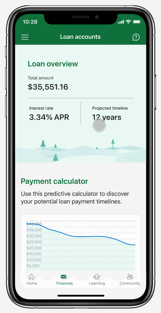
Users can view their account details, budgets, and more within the Finances section. Adding or tapping into a specific account will allow them to see a more detailed information.

Within certain sections of the app, users can view more information about a specific topic or feature along their journey using helpful links and tooltips.
Users can speak to others and gain new perspectives on different financial topics within the Advice section. They can search for specific advice threads or select common topics to get started, as well as view any threads they've saved.

You'd like to give your group leader some kudos for their hard work. How would you find their profile and give them a badge?

I conducted a little more research via survey on how users might prefer to learn and which particular practices speak to them. I also spoke to other designers in the LEAP program for quick feedback on my designs, where I discovered support for immersive learning styles. My usability test through Maze showed me that my revised designs were comprehensible and easy to use.
Showcasing high-fidelity designs based on Fluent.
This was the first time I've experienced working with a design system on a project, which was an interesting process. The team told me I could base my designs on Fluent's library and adjust things as needed. I started by pulling out the components I would most likely need within the app, illustrations, and color schemes. I experimented with different ways I could best represent the information on my high-fidelity wireframes.
Here's a peek at some of the final app screens:

Here are a few moments within the user interface that highlight the different opportunities for learning in the app.
When users first open the app, they can see the Home screen with multiple paths toward learning. We can invite them to begin a lesson through quick actions or continue with ones they've already started beneath "Learning progress." Viewing badges earned can also serve as a motivator for users to continue their positive financial habits.

Users can find alternate ways to learn upon exploring different areas of the app, through use of helpful tooltips and links that will guide them to the appropriate space within the Learning tab.

Learning pathways follow micro-education patterns through the inclusion of smaller lessons within a broader context or financial theme. Users can tap to continue reading through a lesson once they've begun or automatically listen through audio transcripts.

Working with an existing design system and team resources made the creation of high-fidelity wireframes much easier. I found multiple ways to represent how learning can be facilitated throughout the MoneyMind app.
Through my time with LEAP and the Money In Excel team, I learned that the design process is more flexible than I initially thought. I got to experience what it was like to pivot directions and expand further on certain steps after communicating with my team members.
Moving forward, I would begin a second round of testing on my high-fidelity designs and reiterate on feedback as needed. I would also be interested in exploring how to represent the rest of the Money In Excel experience through mobile format.
There is still much more to achieve within the fintech space, especially regarding financial literacy. I recognized how important it was to bridge the gap that many people are left with after not receiving the proper education from schools or their communities. I hope to continue my work and help empower people to take control over their finances and lives.
