
How might we offer an inspiring way to present the missions of nonprofits?

UX Rescue has the goal of creating social impact by connecting volunteers to organizations in need. Their empathetic approach to design helps them better serve these communities and create more outreach.
Currently, they have no way of finding previous clients or volunteer information. Revealing this would not only be helpful for promoting their values but also for acquiring new clients. I teamed up with five other people to look at how we can best present UX Rescue's accomplishments.
Here are some challenges and solutions we found from this project:
Practicing competitive analysis and ideation as a team.
After an initial kickoff meeting, each team member was tasked with analyzing at least two of our competitors. When discussing our findings together, the team discovered that our project required a scope shift to include additional pages. Many of UX Rescue's competitors had multiple instances where they showcased in-depth client stories along with the overall impact they've made.
To provide more context for UX Rescue's impact, we thought to include the following:
With all three of these pages combined, UX Rescue could better serve their community by promoting their work, the organizations they've helped, and their volunteers.

Reviewing some competitor sites made it easier to come up with page ideas of our own. We performed a "Crazy 8s" exercise over Zoom to quickly brainstorm and draw wireframes for an impact overview page, gallery case study page, and single case study page.
Completing the task of 8 wireframes in 8 minutes proved to be more difficult than I'd anticipated, and I definitely had to push myself to complete a drawing with enough information to make sense. Afterward, we shared our work and agreed to reiterate the wireframes in a more high-fidelity format based on our discussion.

In the research phase, my team decided to analyze competitor websites and discover aspects that would benefit UX Rescue. We then performed a brainstorming exercise to capture initial ideas based on the information we found.
Realigning the content of an existing website.
With our additional pages needing a new home, our team decided to look into the current structure of UX Rescue's website. The original navigation was more extensive, with at least eight menu items causing some complications for the new content we would be adding.
There were three different ideations for the sitemap created between myself and two other team members, in which we looked for ways to consolidate the information. In the end, we reduced the navigation menu to contain four main items with dropdowns.

We explored different ways to update the site's navigational structure by creating a sitemap. Keeping the integrity of the original site required thoughtful consideration while making our changes.
Delivering updated designs that matched UX Rescue's style.
Another designer and I moved on to refine our ideas from the previous brainstorming session by creating high-fidelity wireframes. I took on the impact overview and team directory pages, while my design partner focused on the case study pages. We had to keep UX Rescue's existing style guide in mind for our designs, ensuring that the new pages would still feel compatible with the rest of the site.
We received feedback on our wireframes from our stakeholders, and each took turns to present our ideas. This first round of feedback proved to be critical in finding out more about the organization's tone and the direction to take moving forward.


With no developers assigned to our team, the designers were also asked to implement our work onto the Wix platform. Going into this process, I thought I could leverage some of my background using front-end development to make changes quickly.
While the overall coding aspects weren't difficult to do, we realized that the advanced features of Wix were required for our project. I learned the strengths and limitations of using the tool and had to think about what was possible for our stakeholders to replicate in the future. "Would they be able to understand how to recreate this?", "Are there any tutorials or videos they could reference?" were just some of the questions I had to ask myself.

Working with another designer to gather a cohesive look for our wireframes helped me practice communication and collaboration. Receiving feedback from stakeholders gave me a better perspective to design what they truly wanted. Moving further into implementation on the actual website taught me about problem-solving, troubleshooting, and possible technical constraints.
Measuring the success of our new designs.
We decided to conduct usability testing on Maze to find out if our new navigational structure and page formats were user-friendly for people. We chose an unmoderated remote testing method to work within our time constraints for the project.
We found that 6 out of 8 of the major tasks given received at least a 75% success rate from each participant, with areas for improvement being page navigation and finding team volunteer information. At the end of each test, we also asked participants how navigable the site was overall, and getting an average score of 3.9/5 further reflected the problems found throughout the experience.

With a first round of testing complete, we decided to address some of the issues found within our designs.
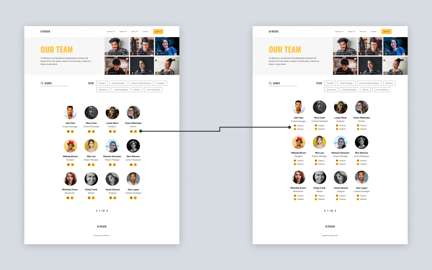
Participants struggled with interactions on the team page and couldn't recognize the icon buttons placed below each member's title. Each was supposed to represent the previous projects they've done with UX Rescue and their personal portfolio/website.
To provide more clarity for the function of these buttons, we decided to add some text alongside each icon and stack them vertically.
Key areas of friction found within the navigation were from the Services, Impact, and About sections. It seemed that participants faced confusion on which dropdowns they should use to access the information they needed.
Since UX Rescue had another project in the works for revamping the visual design of their site, we decided to hold off on making any further changes to the navigation. For handoff, we were at least able to offer a final recommendation of conducting a card sorting activity to gain more insight into the placement and naming of pages.

Following the testing stage, we prepared our files for the final handoff. This included documentation of how we implemented our designs onto Wix, and instructions for any further updates. Creating documentation was an insightful time for me, as it was good practice for guiding stakeholders and purposefully explaining different processes.

Our team went with the remote testing tool Maze to discover where we could improve on our design work. We provided changes and recommendations for UX Rescue during handoff and created documentation materials to guide them through the implementation process on Wix.
I learned a lot from my time with UX Rescue including how to collaborate on a larger team and interact with clients and PMs. I even got to try my hand at some development tasks while carrying out design work on Wix. Overall, this project taught me to be very resourceful with my time and problem-solving skills.
UX Rescue has a bright future ahead with the effort they commit to uplifting different nonprofit groups through design and more. I enjoyed personally supporting their mission and hope to see them continue growing as an organization.
